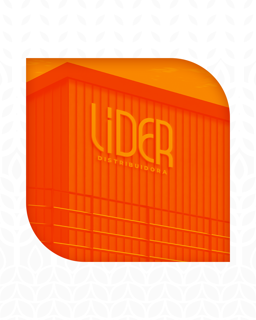
SOBRE A EMPRESA
A jornada da distribuidora de bebidas começou em 1998, com a aquisição da revenda em União dos Palmares (AL). Ao longo dos anos, a atuação foi expandida para Arapiraca (AL) em 2000, Ilhéus (BA) em 2001, Imperatriz (MA) em 2002, Campos de Goytacazes (RJ) em 2004, e Barreiras (BA) em 2006. Atualmente, são mantidas quatro revendas ativas, localizadas em Ilhéus, Barreiras, Arapiraca e União dos Palmares. Entre 2006 e 2014, a distribuidora se destacou como uma das três melhores do Brasil em processos e vendas (PGD Schincariol, PGD Brasil Kirin). Desde 2018, sob o grupo Heineken Brasil, a empresa tem sido continuamente reconhecida com prêmios, incluindo o título de Melhor Revenda do Brasil e 1º lugar em vendas em diversas categorias.
ABOUT THE COMPANY
The journey of the beverage distributor began in 1998 with the acquisition of the branch in União dos Palmares (AL). Over the years, the company expanded its operations to Arapiraca (AL) in 2000, Ilhéus (BA) in 2001, Imperatriz (MA) in 2002, Campos de Goytacazes (RJ) in 2004, and Barreiras (BA) in 2006. Currently, four active branches are maintained in Ilhéus, Barreiras, Arapiraca, and União dos Palmares. Between 2006 and 2014, the distributor stood out as one of the top three in Brazil for processes and sales (PGD Schincariol, PGD Brasil Kirin). Since 2018, under Heineken Brazil Group, the company has been consistently recognized with awards, including the title of Best Distributor in Brazil and 1st place in sales across various categories.
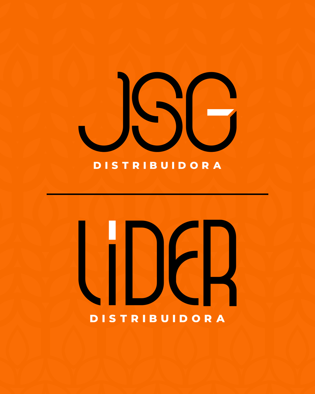
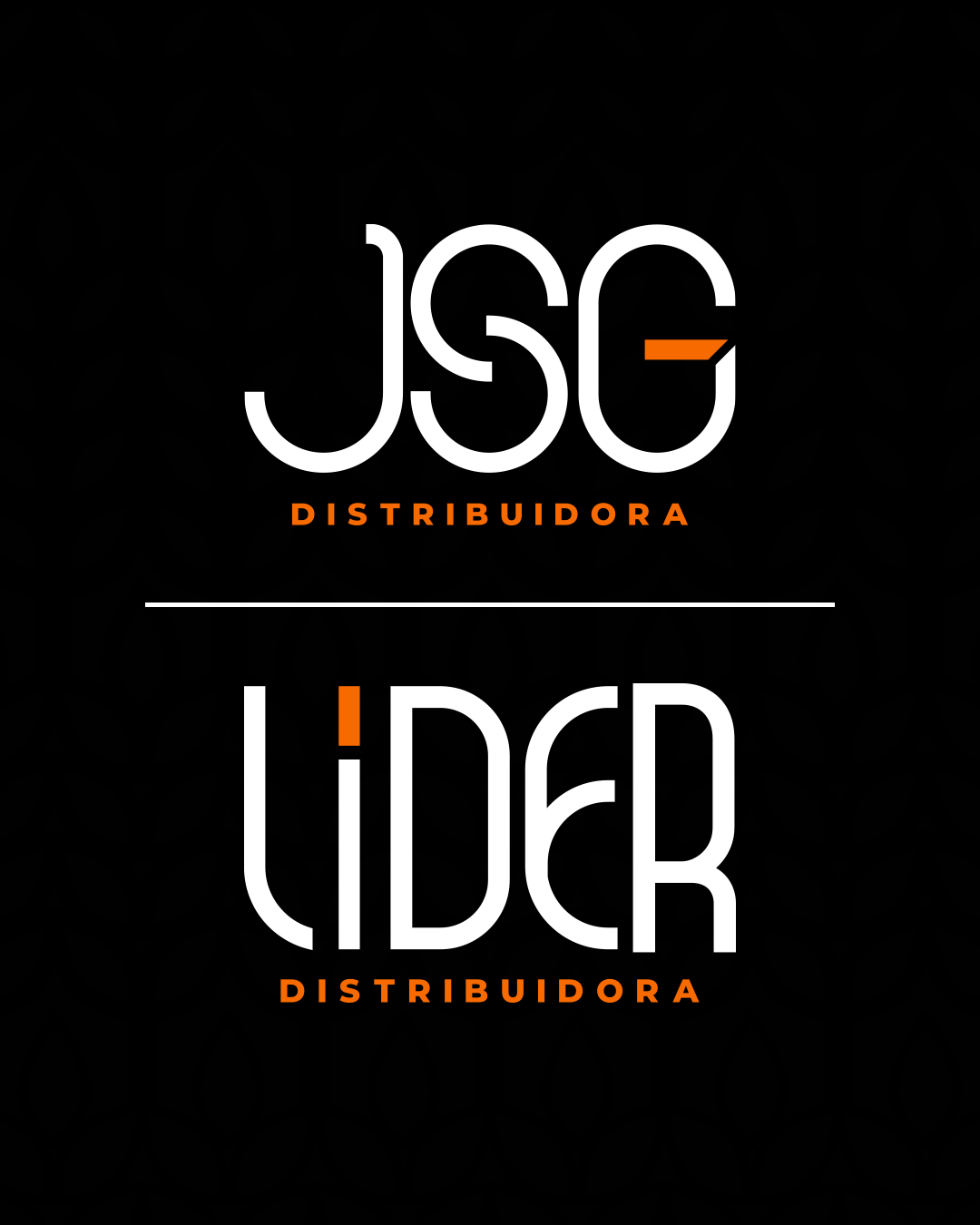
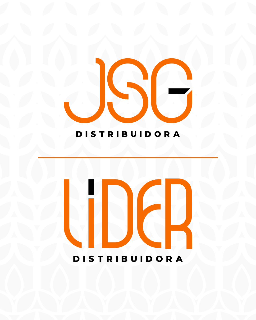
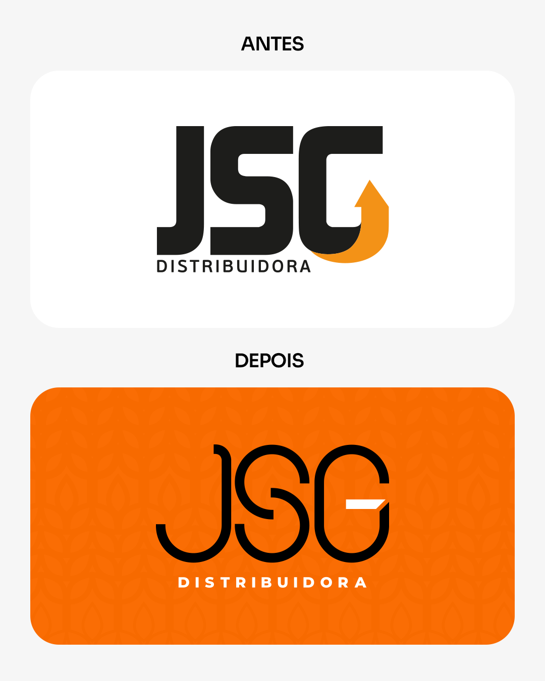
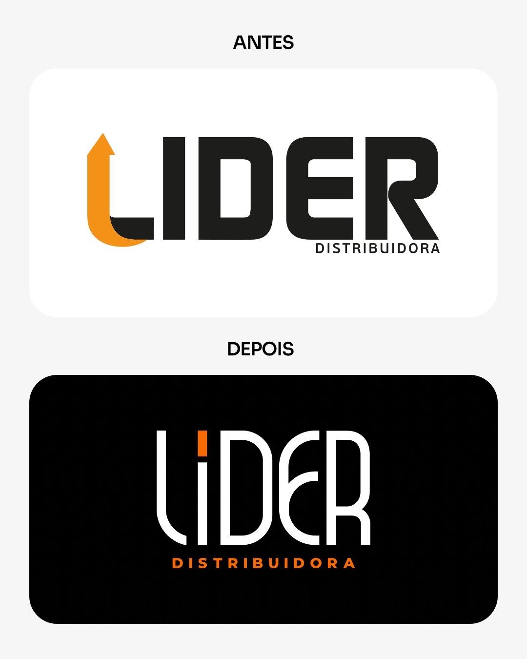
SOBRE O PROJETO
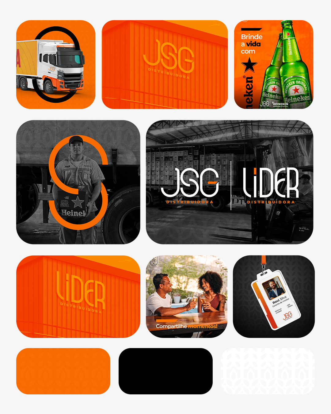
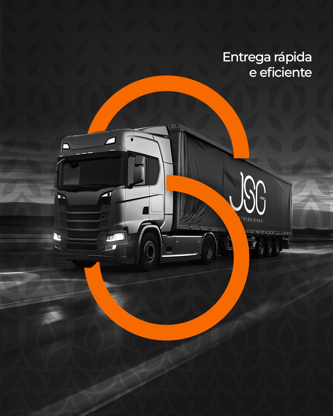
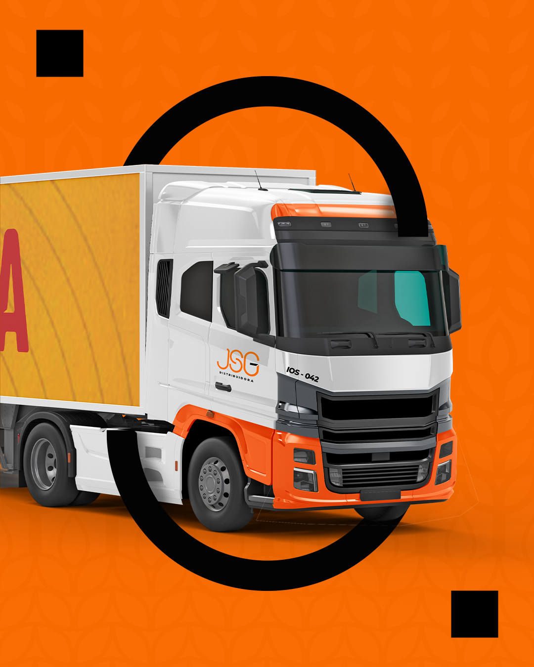
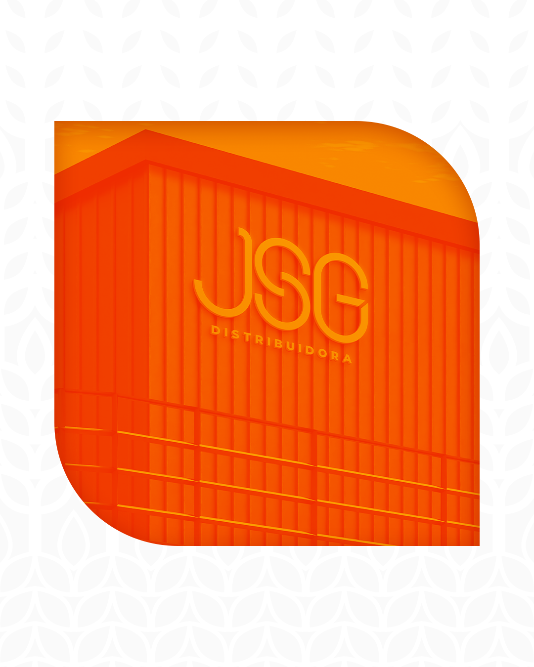
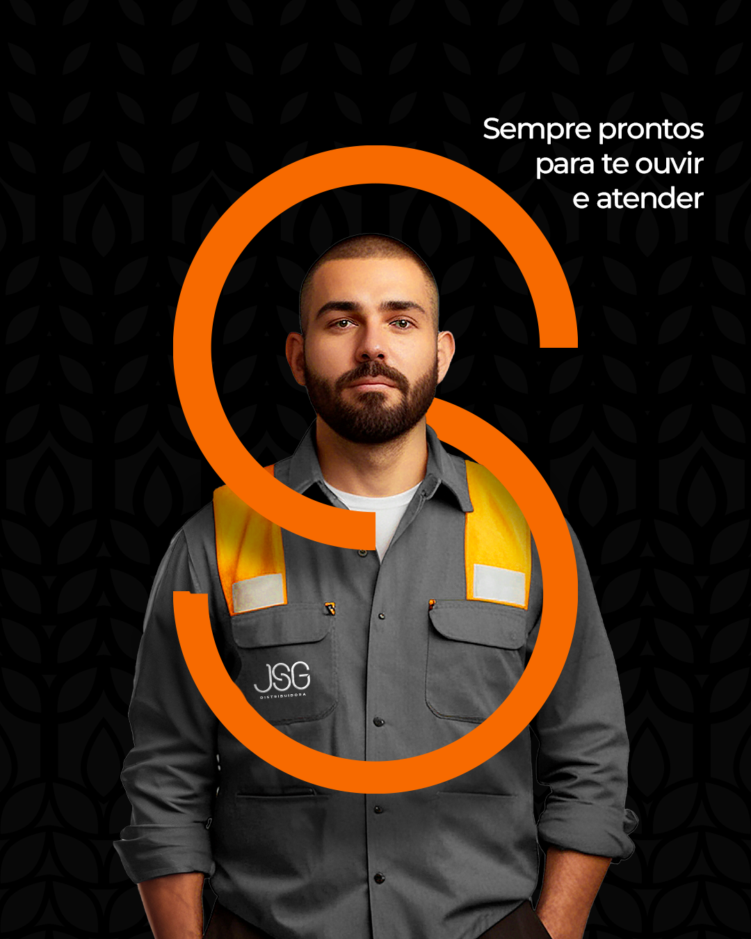
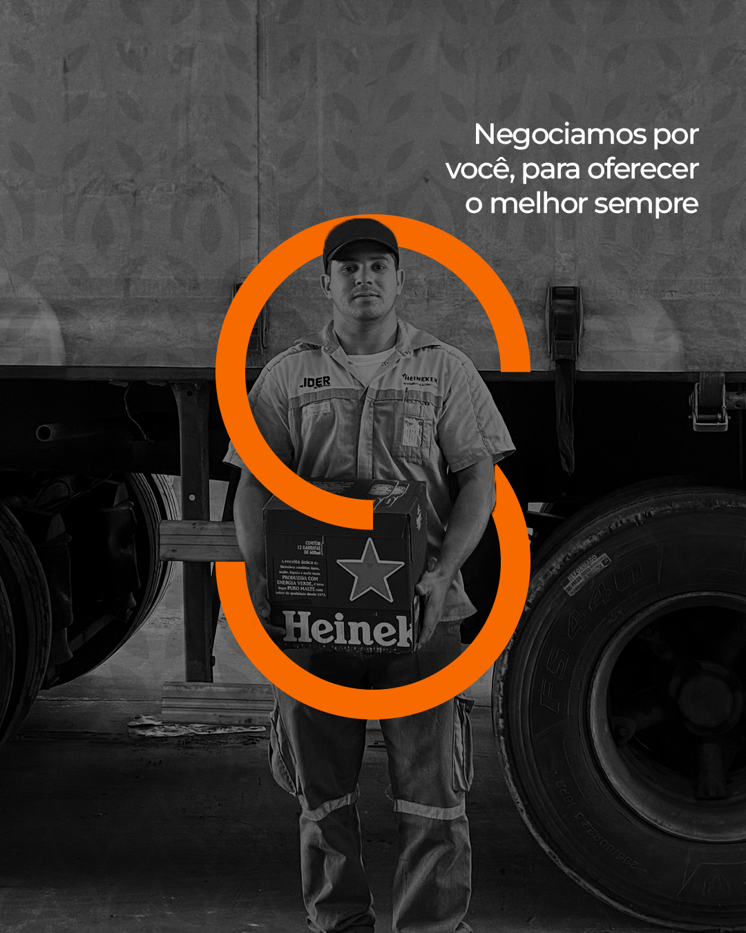
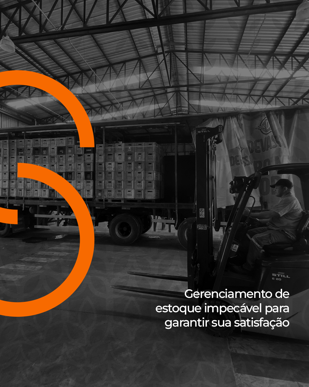
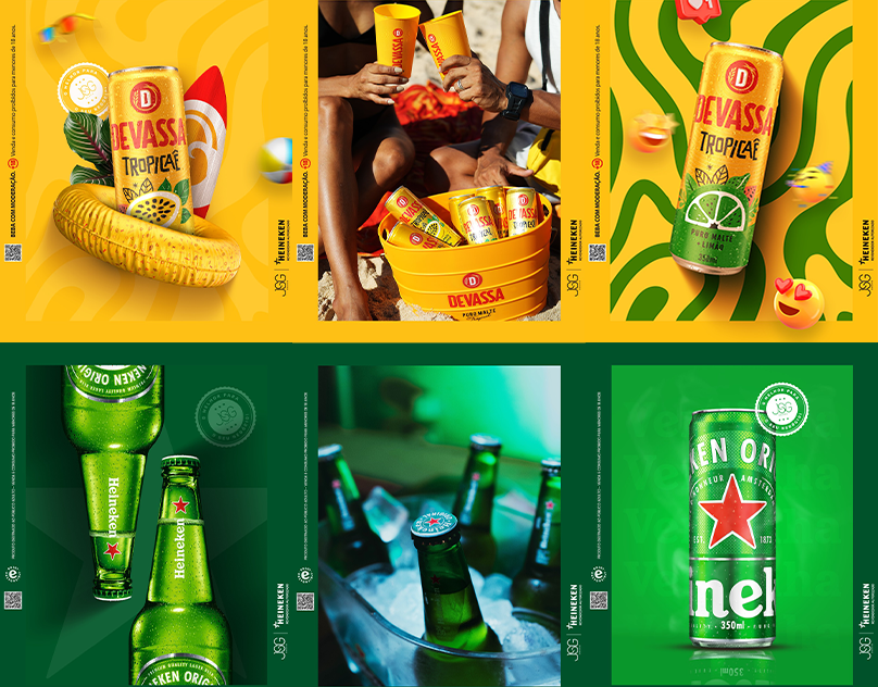
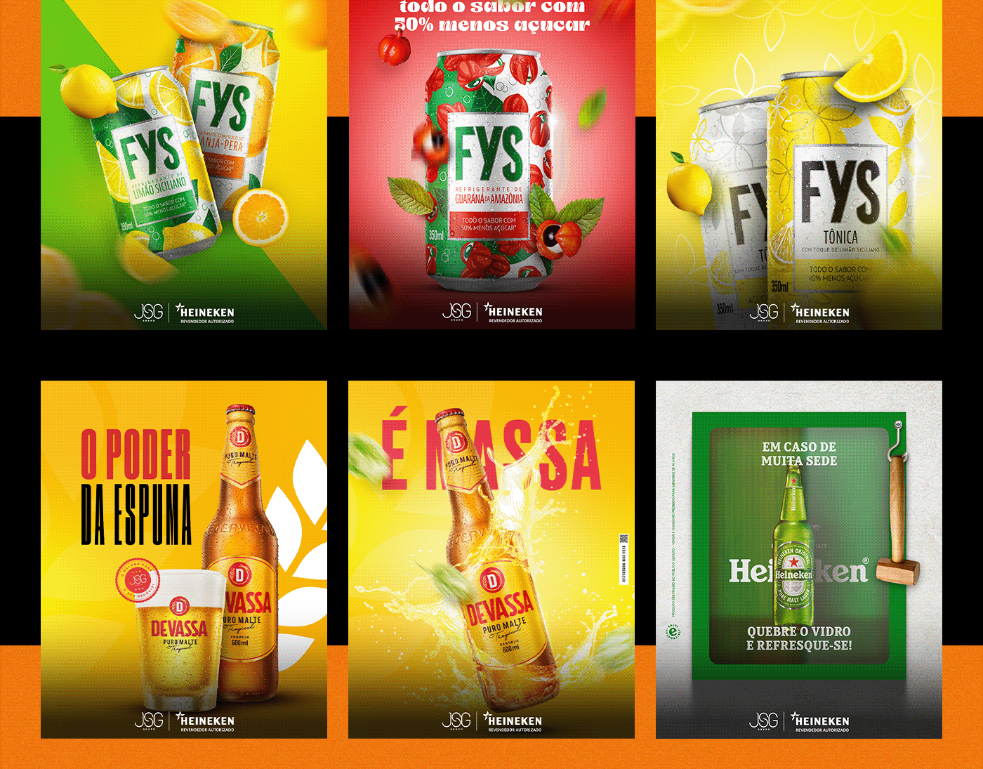
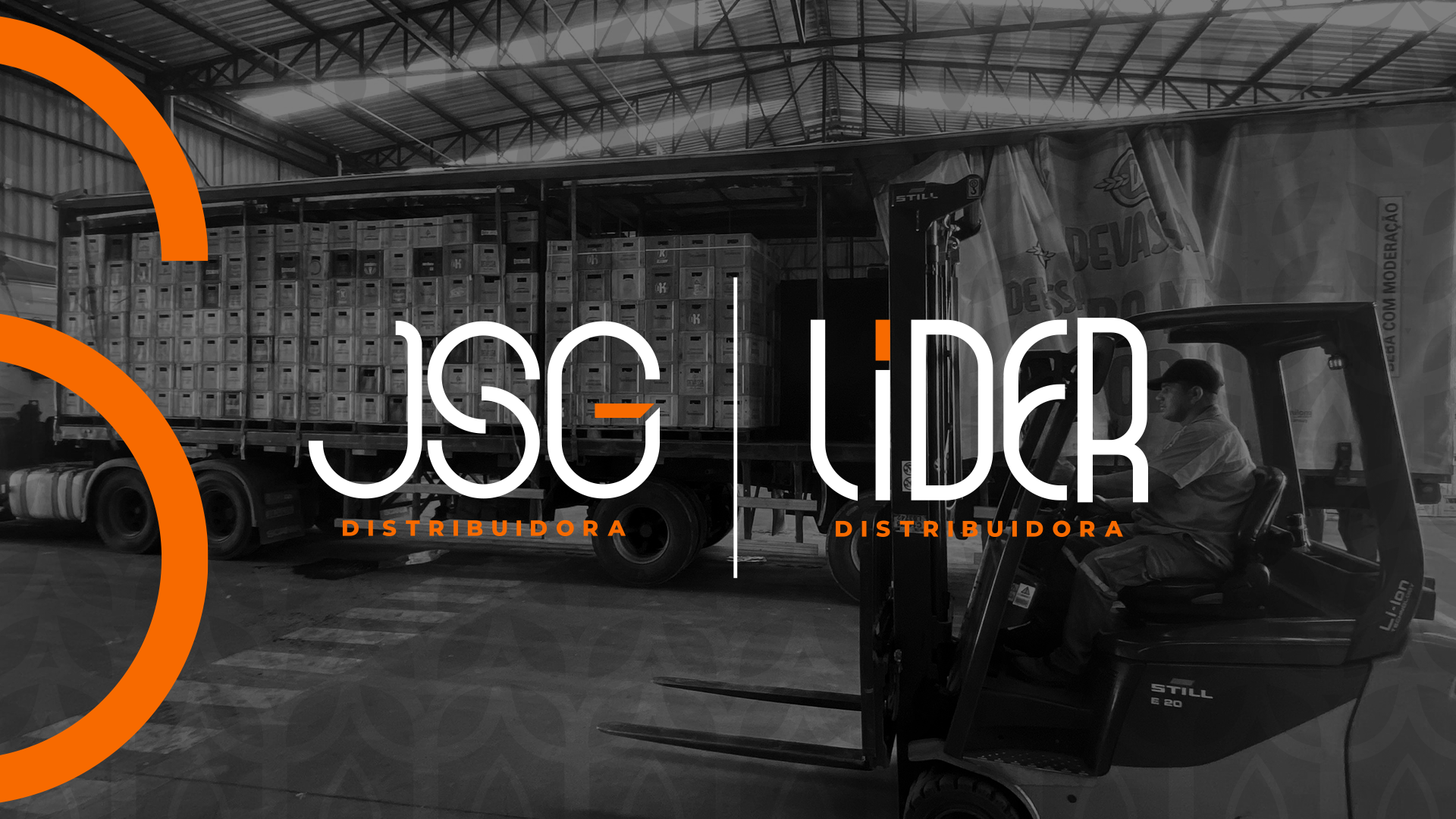
As mudanças visuais exploraram um novo universo visual, com tipografia mais arredondada, seguindo a linha visual da holding que é dona das distribuidoras, o Grupo JSG. As cores mais vivas e vibrantes, o novo visual também trouxe um elemento gráfico especial que remete ao "S" do Grupo JSG, além de outros elementos que remetem a cerveja, como lúpulos, cevada e um limão que representa as bebidas não alcoólicas, traduzindo o portfólio de soluções em distribuição de bebidas variadas.
A nova marca também está alinhada com o propósito da empresa de oferecer as melhores e mais acessíveis produtos, mantendo a qualidade, a rapidez e a autoridade no segmento de distribuição. A distribuidora está em constante evolução e expansão no mercado de bebidas, desde a sua primeira unidade, a empresa já esteve presente em 4 dos 26 estados do Brasil, tendo mais de uma unidade em vários destes e o nordeste ser a região com principal foco da empresa.
ABOUT THE PROJECT
The visual changes explored a new visual universe, with more rounded typography, following the visual style of the holding company that owns the distributors, Grupo JSG. With brighter and more vibrant colors, the new look also introduced a special graphic element that references the "S" of Grupo JSG, as well as other elements related to beer, such as hops, barley, and a lemon representing non-alcoholic beverages, reflecting the portfolio of solutions in beverage distribution.
The new brand is also aligned with the company’s purpose of offering the best and most accessible products, maintaining quality, speed, and authority in the distribution sector. The distributor is in constant evolution and expansion in the beverage market. Since the first unit, the company has operated in 4 of Brazil’s 26 states, with multiple units in several of them, and the Northeast being the company’s primary focus.